
A week or two ago, I went over to PSU for their Open Studios night with my friend Erica, a fellow design-y art school grad. After reminiscing about our own time spent in art school, eating a lot of candy from the candy bar, snaking our way though the maze of grad student studios, and making our own buttons with Letraset transfers, we found our way to the graphic design building. It was great to see all of the branding and packaging projects lining the hallways. There was even a big mural stating "Work hard & eat lots of sandwiches". (Isn't art school the best?) Then we looked through tables and tables of impressively designed business cards, resumes, and portfolios.

I miss art school
It was really interesting to me, having not gone to school for graphic design myself. My background is in fine art, although I did take the two design classes offered at my school. To me it seems like theres a big difference between work you do for a job and work you do for school, but apparently it doesn't have to be like that. These kids are so beyond prepared to enter into the job market and the real world, which was pretty inspiring to me.

I'm not that old, right? But I need to keep up these kids that are younger than me and already doing such great things. So I gave my resume a big overhaul. And I just ordered some new business cards, keeping branding more consistent across everything. The first step was to introduce a logo for myself. I've written my initials like that forever, so it seemed an obvious thing to use. Then I carried the same fonts and golden color across everything. (I just got these super cool new black and gold glasses, which I inadvertently based the colors on.) On my resume, I tried to make everything more digestible by separating it into two columns and creating emphasis with font size and color. See the new vs. old below, and download my new resume here.

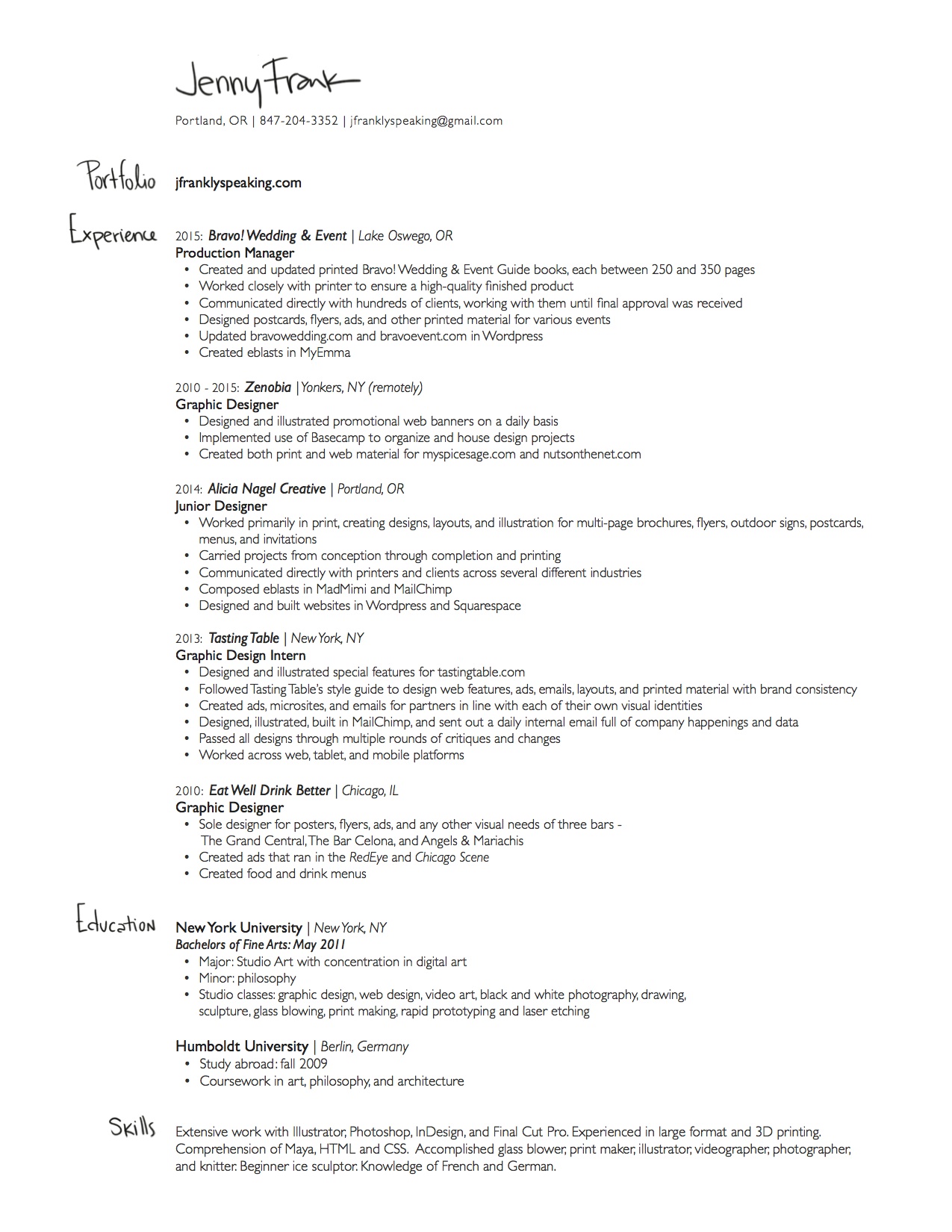
I'm not sure why I haven't updated this before. To be honest, I designed my old resume when I was taking that design class that I mentioned above. That was probably 7 years ago by now. In that class I also designed my first portfolio website, which I then attempted to build in Dreamweaver. I haven't looked at it in a while, but seeing it again after so long, I have to say the idea was pretty great. I didn't have any experience making websites back then, which left me free and open to any ideas. Now, I think, I would be a bit bogged down by thinking of how to build it and what is possible. Too bad. For my first site, I wanted to make these buttons of all different shapes that when rolled over would show a section of the project or piece. Once clicked, a light box would pop up to show the whole thing. I got the light box figured out, but not the image mapping for the buttons. I bet it'd be easier now.
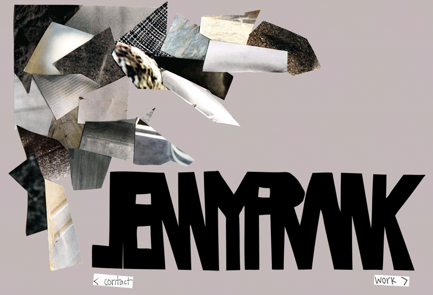
rip first portfolio website
At some point, I moved my website over to Squarespace and lost some of the branding that made my resume design make sense. I got busy with work and life and other things. I am happy to finally say that everything is branded consistently once again. Although I still really enjoy the handmade aesthetic, this new branding definitely represents my continued growth and increased sleek minimal tendencies. The pop up book I made recently is a great combination of both of these ideas, with hand lettering and updated branding. Take a peek!